
When it comes to interior design, color choice is more than just aesthetics; it is essential in determining the whole mood of a room. The study of color psychology explores the substantial effects that various colors have on human behavior and emotions. This article aims to explore the intricate relationship between color psychology and interior painting, offering insights on how to create the right mood within your living spaces.
Understanding Color Psychology:
Before delving into the specifics of interior painting, it’s crucial to grasp the basics of color psychology. Different colors evoke distinct emotions and reactions, influencing our perceptions and moods. Warm tones like reds and yellows are associated with energy and vibrancy, while cool hues such as blues and greens tend to evoke calmness and serenity. Neutrals like whites and grays offer a sense of balance and sophistication.
The Power of Warm Tones:
When considering interior painting with warm tones, it’s essential to recognize their ability to inject energy and vitality into a space. Reds, for instance, can stimulate conversation and add a touch of drama to a dining room or living area. Yellow, with its cheerful demeanor, is ideal for kitchens and other spaces where a sense of warmth and positivity is desired. Strategic use of warm tones can create an inviting and sociable atmosphere within your home.
Cool Hues for Calm Retreats:
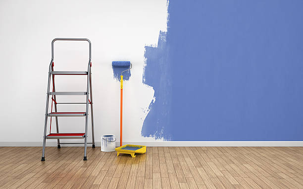
On the flip side, cool colors are revered for their calming effects. Blues, reminiscent of the sky and ocean, can transform bedrooms and bathrooms into tranquil retreats. Green, associated with nature, promotes relaxation and rejuvenation. When applied through interior painting, cool hues provide a serene backdrop, making them perfect for spaces where a sense of peace and tranquility is paramount.
Neutrals for Versatility:
Neutrals form the backbone of many interior color schemes due to their versatility and timeless appeal. Whites convey cleanliness and simplicity, making them a popular choice for kitchens and bathrooms. Grays, on the other hand, exude sophistication and work well in both contemporary and traditional settings. Neutrals offer a blank canvas that allows for the integration of various décor styles and accent colors.
Strategic Use of Accent Colors:
While the primary color scheme sets the tone, the strategic use of accent colors enhances the overall impact. Accent colors, when thoughtfully incorporated through elements like furniture, artwork, or accessories, can amplify the desired mood. For instance, adding pops of vibrant red or orange in a predominantly neutral room can infuse energy and visual interest without overwhelming the space.
Creating Harmony with Color Combinations:
Achieving a harmonious color scheme involves more than selecting a single hue. Interior painting often involves the use of color combinations to create a cohesive and balanced look. Analogous color schemes, where colors sit next to each other on the color wheel, provide a subtle and harmonious appearance. Complementary color schemes, with colors opposite each other on the wheel, offer a dynamic contrast. Understanding these principles allows homeowners to craft a visually pleasing and emotionally resonant environment.
Adapting Colors to Room Function:
Beyond personal preferences, the function of a room should guide your choice of colors. For spaces meant for relaxation, such as bedrooms or reading nooks, subdued and calming colors work best. In areas designed for socializing, like living rooms or dining spaces, warmer and more energetic tones can foster a lively atmosphere. Home offices benefit from colors that enhance focus and productivity, such as shades of green or blue.
Consideration for Light and Space:
Natural and artificial lighting significantly influence how colors are perceived within a space. Rooms with ample natural light can accommodate bolder and darker colors, whereas poorly lit spaces may benefit from lighter hues to create a more expansive and inviting atmosphere. Additionally, the size of a room plays a role; lighter colors can visually expand smaller spaces, while darker colors can add intimacy to larger rooms.
Practical Tips for Interior Painting:
When translating color psychology into your interior painting project, practicality is key. Begin with small test patches to observe how colors interact with the room’s lighting throughout the day. Invest in high-quality paints to ensure a lasting and vibrant finish. Don’t shy away from experimenting with different shades and combinations until you find the perfect balance for your space.
Conclusion:
In the realm of interior painting, color psychology serves as a powerful tool for transforming a house into a home. By understanding the emotional impact of different colors, homeowners can create spaces that not only please the eye but also evoke the desired mood and atmosphere. Whether you opt for warm, cool, or neutral tones, the art of interior painting becomes a nuanced expression of your personal style, contributing to a living environment that is both aesthetically pleasing and emotionally enriching.